Illustrator of the BGF 2016 & 2017 posters

Trained in comic art at Saint-Luc Brussels and animation at La Cambre, Florence Bolsée worked for many years as an illustrator and animation director. Now a web developer, she continues to draw for pleasure, mainly using watercolour. She’s drawn to natural, folkloric or fantastical worlds, which she explores through collaborative challenges like Inktober. For the BGF, she created two posters where precision, poetry and imagination blend seamlessly.
How did you approach creating this poster?
Was there an idea, mood or message you wanted to convey?
I mainly wanted to maintain visual continuity with the previous posters, keeping key elements and colours.
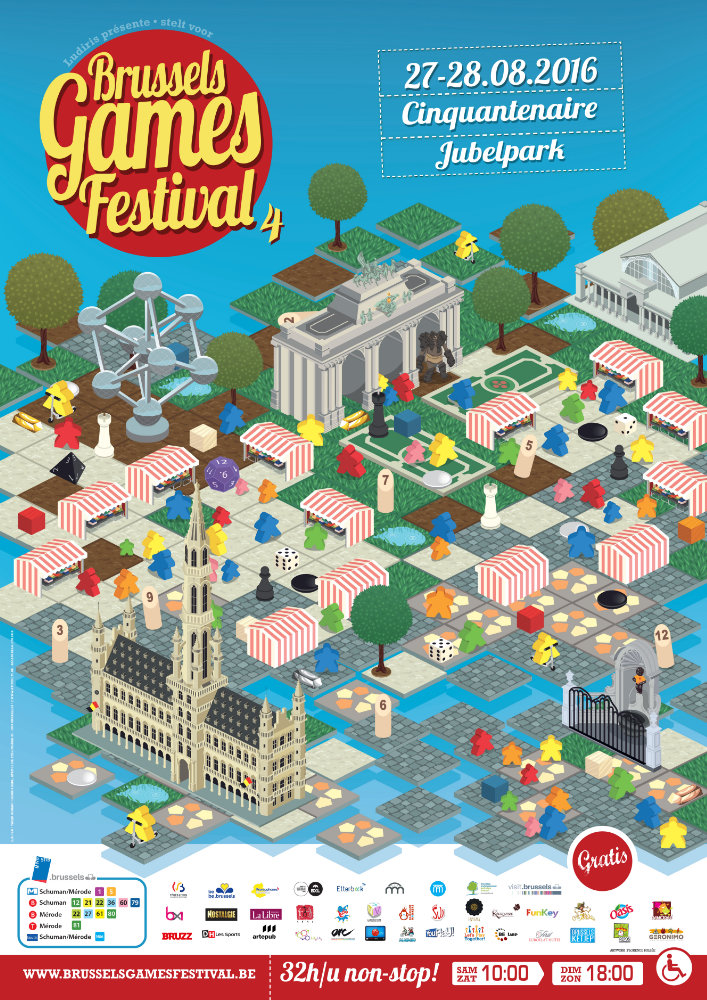
For the first poster, I was drawn to the idea of using an isometric perspective, a style often linked to video games. It felt like a good way to represent a playful world.
For the second, I simply wanted to draw a floating island, and return to a warmer, more textured style. My aim was to evoke imaginary worlds.
In both cases, I was also thinking of board games — these objects that build tiny worlds on a table, with tiles, tokens and boards.
What do these posters mean to you?
A true sense of pride.
Seeing my posters displayed all around Brussels was really striking.
I haven’t often had the opportunity to see my artwork shared in such a concrete way, and I was truly happy to contribute to the cultural life of my city.
If you had to describe your posters in three words, which would you choose – and why?
First poster: immersive, geometric, meticulous.
I paid a lot of attention to detail in its execution.
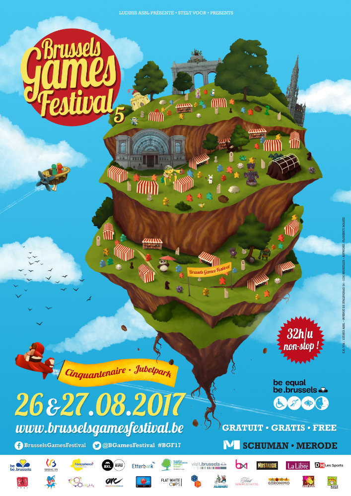
Second poster: warm, dreamlike, airy.
It has a gentle quality, like something you’d find in a children’s book.
What memory stands out from illustrating for the BGF?
The first poster required a lot of mathematical thinking, which I found very stimulating.
I’ve always loved maths and logic — interests that now serve me well in web development, where I get to combine coding and visuals.
These two posters remain among my most positive artistic experiences to date.
Is there a detail or easter egg in your poster that few people notice?
Absolutely — there are plenty of nods to board games that keen players might recognise.
But in the first poster, the tiles were especially inspired by an aerial view of Parc du Cinquantenaire, particularly its formal French gardens.