Fred Navez – Illustrator of the BGF Posters from 2018 to 2021

A graduate in illustration from Saint-Luc Brussels, Fred Navez began his career by blending drawing, graphic design and advertising. Passionate about board games, he has worked on titles like When I Dream and Marchands du Nord, and is known for his “chameleon” style, allowing him to adapt to a wide range of visual approaches. His contribution to the BGF spans three consecutive editions, with posters that are rich, interconnected, and always full of playfulness.
How did you approach creating these posters?
Was there an idea, mood or message you wanted to convey?
For all three posters, I had the pleasure of working with Tanju Goban, who was the festival’s coordinator at the time. It was a great collaboration, where the concepts evolved organically together.
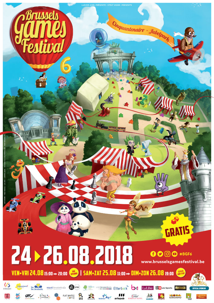
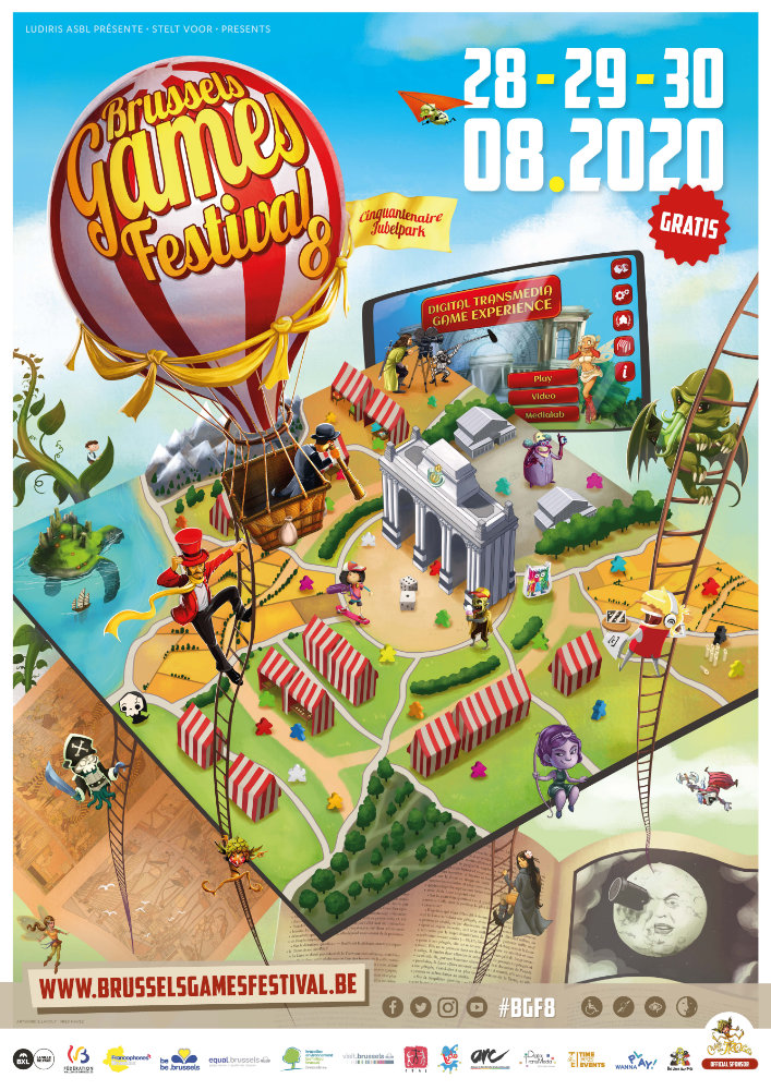
In 2018, the focus was on the Parc du Cinquantenaire, and the idea was to highlight the connections between different gaming worlds.
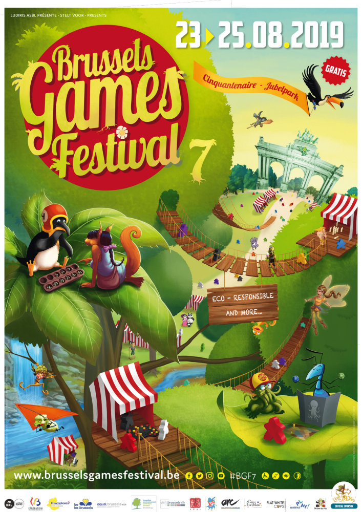
In 2019, we continued in the same direction, but added an eco-conscious layer — hence the lush greenery.
In 2020, we kept the same base but extended the concept of interconnection to include other media like comics, cinema and mobile games. And of course, being a special year, we made a version of the poster where all characters wore masks.
What do these posters represent to you?
They’re very meaningful to me.
They reflect my vision of games and illustration: a creative abundance, filled with diverse ideas and styles.
They also mark a very prolific phase in my career — one that was unfortunately cut short, first by Covid, and then by the rise of AI.
If you had to describe your posters in three words, which would you choose – and why?
I think three words sum them up well:
Abundance, diversity, fun.
What memory stands out from illustrating for the BGF?
A really great one.
In addition to the illustrations, I also handled the entire graphic design for the events: maps, programmes, banners, T-shirts, flyers, coasters…
It was sometimes intense, but always in a good mood, with a strong team spirit. Working around a shared passion for games was incredibly rewarding.
Is there a detail or easter egg in your posters that few people notice?
Yes! I’m a big fan of Lovecraft, especially Cthulhu… and he appears in every single poster, in different ways.
A few examples:
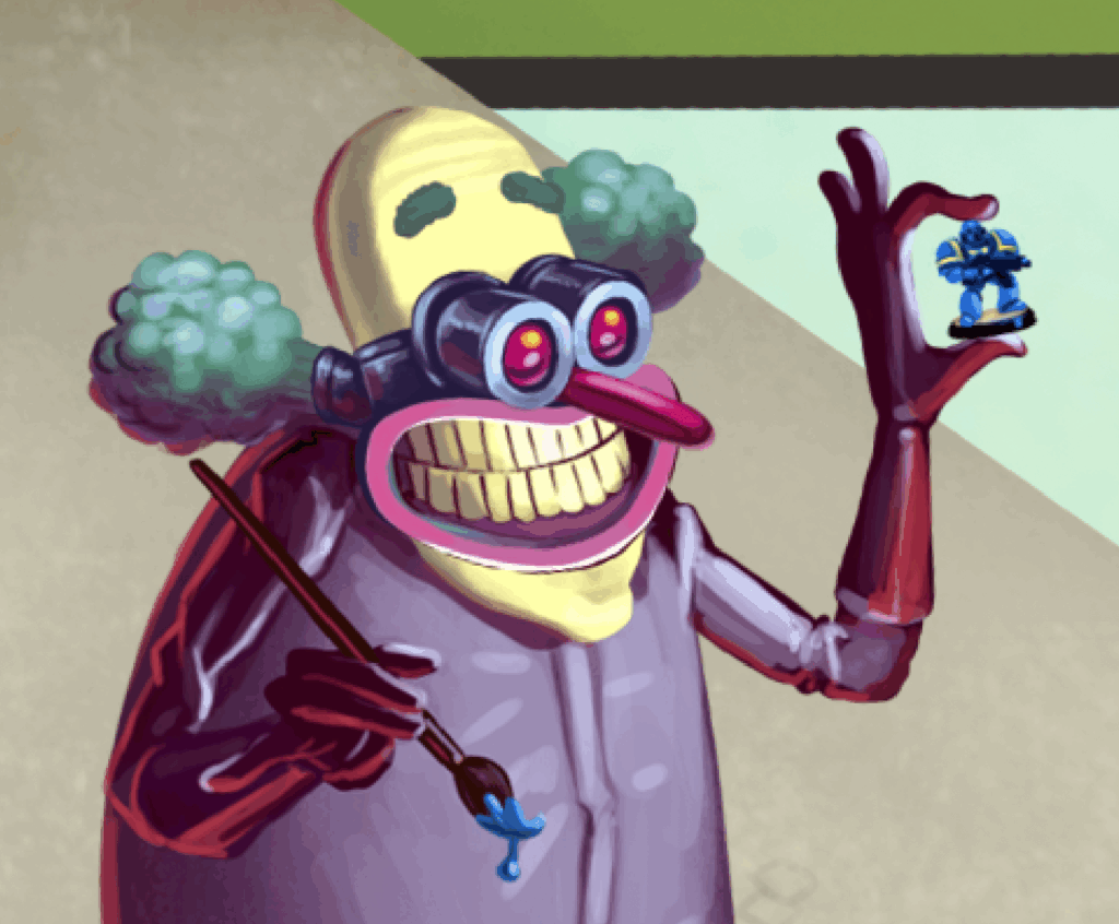
In the 2020 poster, few noticed that Professor Nosides is admiring a Space Marine he just painted!
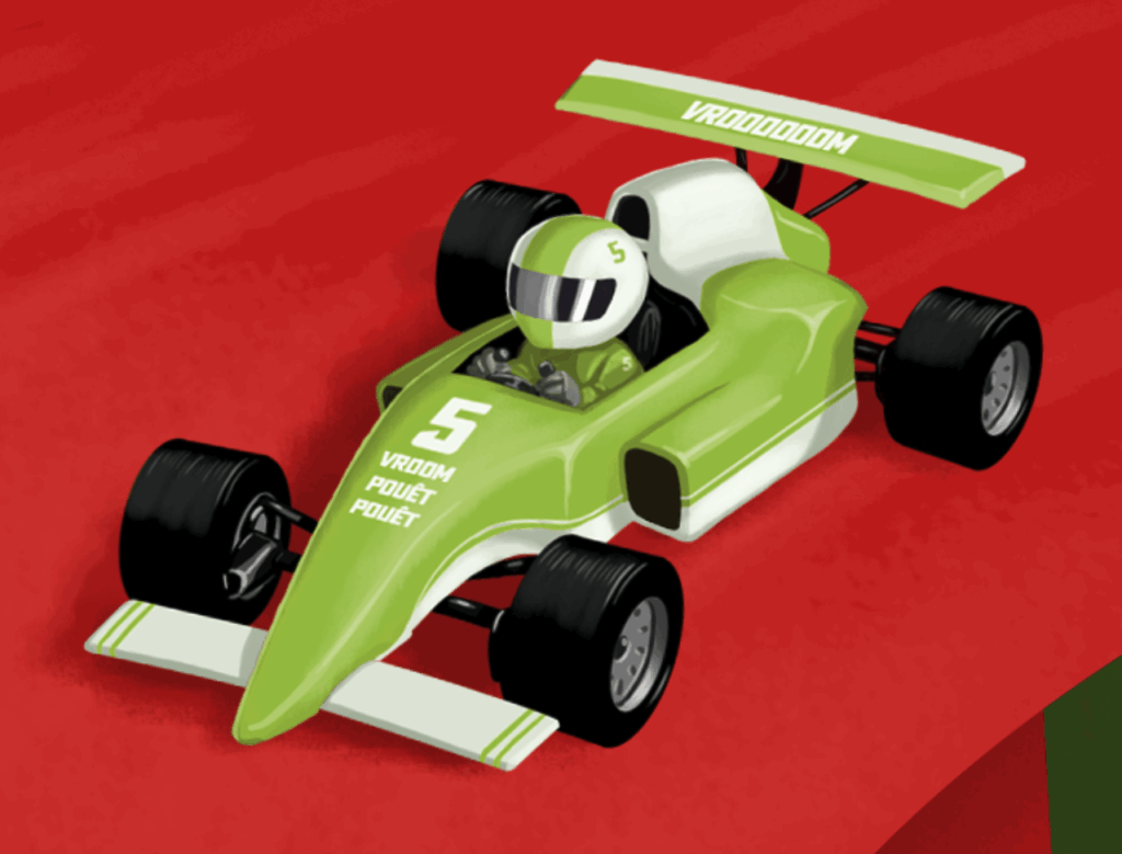
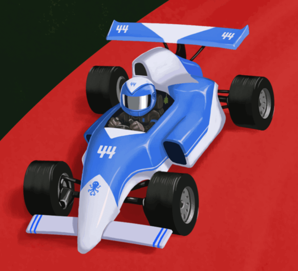
In the 2018 poster, the blue Formule Dé car has a tentacle on it (Cthulhu again!), a number 44 (an inside joke with friends), and even a little scented pine tree in the cockpit. The green car has a very unusual team name too 😉
Info & Contact
📧 navez.fred@gmail.com
🖼️ Portfolio (WeTransfer)